There are certain project themes that recur every year in physical computing classes. Many of them are ideas that lend themselves to multiple interesting variations, and are valuable ways to learn about physical interaction through doing. Others don’t offer only limited interactive possibilities, but capture the popular imagination because they’re simple and quite often pretty to look at. What follows is a review of some of the themes I see frequently. These are by no means the only themes that come up, nor are they the only things you can do with physical computing. Many physical computing projects feature two or more of these themes.
Sometimes when people learning about physical computing hear that a particular idea has been done before, they give up on it, because they think it’s not original. What’s great about the themes that follow here is that they allow a lot of room for originality. Despite their perennial recurrence, they offer surprises each time they come up. So if you’re new to physical computing and thinking to yourself “I don’t want do to that, it’s already done,” stop thinking that way! There’s a lot you can add to these themes through your variation on them.
Theremin-like instruments
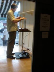
Musical instruments are great physical interaction projects because you can’t think about your actions when you make music, you have to think about the music. The theremin is usually the first instrument people build because it’s the simplest to make: attach a photocell or distance ranging sensor to a microcontroller’s analog input, send the results into a synthesizer or music program, and you’re done. When you wave your hands above the cells, they block the light and you generate music. The results can be very pleasurable. Greg Shakar’s Red Urchin shown here is a good example.
The limitation of this is that the gesture of moving your hand over a sensor has little meaning by itself. The challenge here is to come up with a physical form and context for the sensors that afford a meaningful gesture.
Gloves
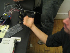
Gloves are almost as popular as theremin instruments, and the most common variation is the drum glove. Why? Because it’s fun. And because it relates to an activity most people do and understand already: tapping on something with your fingers to make a rhythm. Compared to the theremin, it offers a bit more structure: with drum gloves, you’ve already got a gestural language you’re borrowing (tapping) which makes it easy to generate discrete notes.There are other types of glove projects that come up, because we do so many gestures with our hands. There are pointing and gesturing gloves, like the Mattel/Nintendo Power Glove from 1989. Drum gloves are probably the most primal, though, and in my opinion, the most fun. The interaction is direct and simple, yet structured so you don’t feel like you’re starting from scratch when you put them on. Shown here: Jeff LeBlanc and Chris Kairalla’s Megatap 3000.
Probably the easiest way to sensors to a glove is to attach force-sensing resistors to the fingertips. These will let you sense tapping of the fingertips. If you need to sense the bend of the finger, you can attach flex sensors along the length of the fingers. This is how the Power Glove detects finger bending. I’ve also seen a couple variations that used an LED at each fingertip, a photocell or photodiode at the wrist, and a length of fiber optic cable connecting them. If the fiber optic is scored at each knuckle, it allows light to escape proportional to the bend of the finger.
Floor Pads
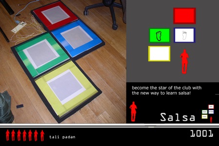
Dance Dance Revolution! Sonic Twister! The piano in “Big”! Fabrica’s Tuned Stairs! Dance Dance revolution! Dancing is one of the most enjoyable forms of physical expression, and the easiest way to sense it is by sensing where you land. and they’re relatively simple to make. All you need is a few switches on or under a floor. I love these. The irony is that many geeks don’t like to dance. Perhaps we should do so more often.Tali Padan’s Salsa 1001 was a system to teach people to salsa by doing it. Much to Tali’s chagrin, I still can’t salsa, but I didn’t spend enough time with the project to master the dance.
Video mirrors
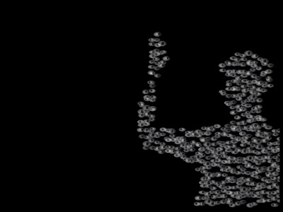
All hail Myron Kruger! This one’s been around for decades. Dan Shiffman does these really nicely. Processing and Max/MSP/Jitter enable these par excellence.
Video mirrors are the simplest thing computer vision project you can do. They’re the screen-savers of physical interaction in that they’re very pretty, and you can stare at them all day, but there’s not much structured interaction. They simply mirror your action. I call them hand-wavers because, well, that’s what you do. There are some examples of video mirrors that suggest activity in a slightly more narrative way. in Camille Utterback and Romy Achituv’s Text Rain, letters continually drop from the top to the bottom of the screen on the viewers’ silhouettes, inviting them to play with the letters.
Shown here is my early attempt to make a video mirror, The Eye Thing. What took me several weeks when I made it in 1999 could be done in about an hour today, thanks to better tools for the job.
Mechanical pixels
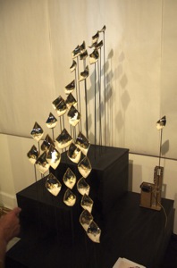
Mechanical pixels are a follow-on from video mirrors. Once you can move one thing, it seems really cool to move lots of things and make a picture out of them. Artist Daniel Rozin has made a series of mechanical mirrors on this theme. LIke video mirrors, projects on this theme tend to offer little in the way of structured interaction. The best ones are examples of simple behaviors, with a strong focus on the aesthetics of the look, the behavior, and the sound. The trick to doing this well is to have mechanical precision, money, and patience.
Soyoung Park’s Waves of Leaves is a beautiful example of this theme. As a person passes by this sculpture, the ceramic leaves raise and lower in a wave, starting at the top and moving to the lowest part of the sculpture. As the leaves move, they collide gently with each other on their stalks, creating a quiet tinkling sound.
Scooby-Doo Paintings
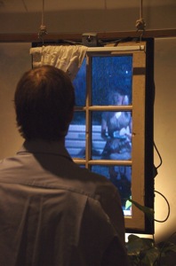
If you’ve ever seen an episode of the cartoon Scooby-Doo, you remember the painting that had eyes that follow you. It happened in almost every episode. As Scooby or Shaggy walked by the painting the eyes followed them. This idea, an interactive painting or display that responds to the viewer’s action, is very popular. The simplest variation has a distance sensor built into the frame, and a change in the sensor’s reading triggers the painting to take action.
The most common mistake made by designers of this type of project is to confuse presence with attention. Presence is easy to sense, as described above. It’s harder to tell whether someone’s paying attention, though. More sophisticated variations on this theme use a camera instead of a distance sensorto detect a face and eyes. You’re still guessing about attention, but if you see a face and eyes, you can assume the person’s at least looking in the direction of the display (assuming he can see).
Ramona Pringle and Charles Amis’ Curious Window is shown here. The camera tracks the viewer and adjusts the view into a scene playing behind the window.
Body-as-cursor
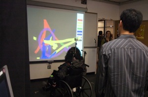
These projects involve the user by tracking her movement in a defined space and mapping that movement to a visual or audio response, usually onscreen at the periphery of the space. There are two common technical variations: tracking the participant with distance rangers that ring the perimeter of the space, or using a camera mounted over the top of the space to use computer vision to track him in two dimensions.Whether it’s done with video tracking or distance rangers, the effect is the same. A person moves in a space, and their position in that space affects the output. Her whole body is effectively a cursor. Interaction is generally limited to step-and-observe. The interaction affords movement in a large space but tends to ignore the gestures and poses that make up our body language.
Younghyun Chung’s Digital Wheel Art, shown here, is a particularly effective variation on this theme. It’s designed for a patient with limited or no functionality in his arms and legs. The client, an avid painter, had previously used only a tool for painting that allowed him to hold the brush in his mouth. Younghyun mounted a cluster of infrared LEDs on a pole extending from the wheelchair and a low-cost infrared camera to track the position of the LEDs. The system allowed the client to gesture by moving his chair (which he could already control using head switches) and change the brushes and colors using switches added to his head mounted chair controls.
Hand-as-cursor
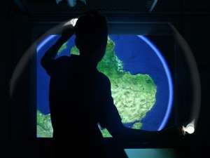
These are variations on video mirrors and body-as-cursor in which a camera tracks your hands and causes a projected graphical user interface to react accordingly. Hand-as-cursor offers more in the way expression than body-as-cursor or mirrors. These projects usually track the user’s hands or arms or feet and respond to specific gestures. Wand-driven interfaces are a subset of this type of project. Dan Phiffer and Mushon Zer-Aviv’s Atlas Gloves is typical of works in this theme. A video camera tracks two lit balls held in the hands, and takes action based on the position and movement of the balls. By gesturing, the user navigates around Google Earth. It relies on computer vision and two easily distingushable points on the body. The use of lights as the tracked points allows them to filter out everything but the brightest two blobs in the camera’s view, simplifying the tracking. All video tracking problems face environmental limits. In order to recognize or track an object moving in the camera’s field of view, you need to filter out the background. This can be done by using a uniquely colored object, by using an object that emits infrared or ultraviolet light and filtering out visible light at the camera, or by comparing the current frame to a pre-determined reference frame of what the space looks like empty.
Multitouch Interfaces
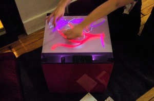
Multitouch surfaces are the tangible version of hand-as-cursor. A sensing surface that can sense more than one point of contact at a time is the basis for this theme. There are many ways to create such a system. All of them take a good bit of work and a fair amount of tuning the system. One variation involves flooding the surface with infrared light from behind or from the side, and tracking the surface with a camera fitted with a visible light filter that filters out all but infrared light. Hands and other objects that touch the surface show up distinctly from the background. Another variation involves using multiple distance sensors tracking the perimeter just above the surface, as with body-as-cursor. These tend to be difficult to maintain, however. A third variation uses a field of capacitive touch sensors which trigger when humans touch the surface.The biggest drawback besides the difficulty of tuning them is the fact that a flat surface offers no tactile feedback to guide you in using the interface. Try dialing an iPhone in your pocket to understand how this limits both blind and sighted users alike. It definitely has its uses as an input, but it shouldn’t be applied universally.Shown here is Addie Wagenknecht and Stefan Hechenberger’s CUBIT. This system uses the infrared light and camera variation to track the user’s fingers from behind the screen.
Tilty stands and tables
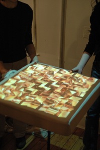
These are flat surfaces that respond when you tilt them. The tilty table is usually a table with an accelerometer or tilt sensor built in and a projection on its surface, as shown here in Erin Ha Kim’s In & Out. The projection reacts to the physical tilt of the table as if it shared the physics of the table. The tilty stand is a surface that the user stands on, balancing himself to navigate a two- or three-dimensional space. The stand is physically challenging to operate because it upsets the user’s balance, and it’s endless fun to play when coupled with a game that reacts in real time. I think these are fun because they appeal to our desire to disrupt furniture.
Tilty Controllers
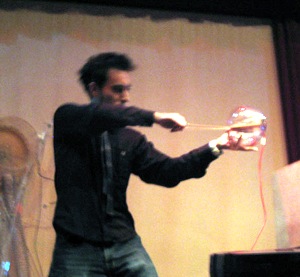
Tilty controllers react to the tilt of an object in your hand. Michael Sharon’s Stranglophone, shown here, is a musical instrument. It reacts to the tilt of the ball, so the performer can be very dramatic in his gestures. These are best when designed for a specific action, generally, but the Wiimote has managed to blow that away by mapping a generic controller to a whole range of specific behaviors.Like tilty tables, these are usually made of an acclerometer or gyrometer if you need the angle of the tilt, or a ball switch if you don’t.
Things You Yell At
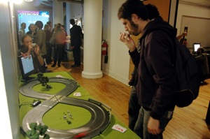
People take great visceral pleasure and yelling at things. Projects that react to a yell are very satisfying, even though the interaction is very simple. Measuring the sound level is very easy, using a microphone connected to any computing device, whether it’s a microcontroller, personal computer, or mobile phone. The advantage to using a mobile phone, as shown here in Christopher Paretti’s SpeedDial or a personal computer is that, if you want to react to something more than the sound level, you can do so relatively easily. Pitch detection and voice recognition are too computationally intensive for a microcontroller.
Meditation Helpers
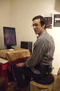
Meditation helpers are objects, systems, or rooms that react to your state of mind to get you into a more meditative state of mind. The problem with many of them is that a machine can’t read your state of mind. You can read breath rate (through a microphone or stretch sensor around the chest), skin galvanic response (by measuring the resistance across the skin) heart rate (using a heart rate monitor or pulse oximeter), or posture (using accelerometers, as shown here in Jeff A. Sable’s Compass-Ion Organ). Reading involuntary reactions like this doesn’t tell you the meditator’s state of mind, but it lets you make some guesses and take action based on those guesses.
Fields of Grass
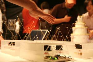
Fields of grass are arrays of sensors, generally in a grid, that you run your hand over and touch to make music, light, or some other output. This one comes up frequently: “I want to make a field of grass that you run your your hand over, that responds to where your hand is.†Why? Because the idea of a responsive texture is magical, I guess. They can be difficult to do well because they generally require a large number of sensors, actuators, or both. In addition, the sensors and actuators need to be small so the stalks can be close together. The best results are usually achieved by attaching multiple stalks to one actuator, and using as few sensors as you can get away with to give the impression of individual stalk response without having to make each one respond individually. Terence Arjo’s Cousteau is one of the most pleasant of these I’ve seen.
Remote Hugs

Two paired objects that communicate a feeling over a network. To use Clay Shiky’s phrase, they carry “phatic communication stripped of verbal language.” To be honest, I don’t really understand the motivation behind these. They are often beautiful objects, and they provide an good creative challenge for the designer, but I have yet to see one that truly communicates the sense of warmth and well-being that’s hoped for. They’re pleasant, but I haven’t felt hugged yet. I remain hopeful, because it’s a very popular theme. Shown here is Oli Stephenson and Emily Conrad’s HeartBeat. The heart beats faster when your loved one’s cell phone is detected in a cell that’s closer to you.
Dolls and Pets
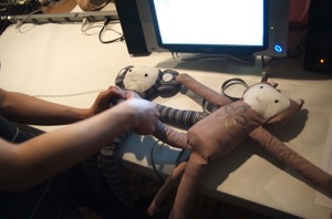
things you pet, touch, etc that have an anthropomorphic behavior in reaction. The toy industry thrives on these. Interactive dolls and pets are popular because we like things that appear behave like us. Reeves & Nass discuss this in depth in The Media Equation. We like pets, and if we can build them to respond how we want and not poop or scratch the furniture, all the better. Noriaki Okada and Soyoung Park’s Interactive Dolls, shown here, respond onscreen in appropriate ways when you make the dolls shake hands, hug, or hold hands.
LED Fetishism
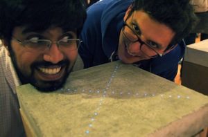
Come on, who hasn’t made a project that’s a grandiose version of the blinking LED? We’re all guilty of doing the gratuitous LED project, because it’s too much fun. When — not if — you do it, make it interesting. Vikram Tank and Ithal Benjamin embedded Set In Stone in concrete with touch sensors.
And finally…
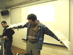
A couple of hybrid projects that make me smile. Ed Guttman and Ayad Alkadhi’s flight simulator is a cross between a tilty controller and a (really big) glove. They reckoned that flight simulators would be a lot more fun if you could fly like a bird. An accelerometer on the back and flex sensors under the wings make it possible for them to detect flapping and gliding.
Dan Hirschmann’s Glowbits is a combination of mechanical pixels and LED fetishism. The LED balls, mounted on motorized linear potentiometers, can be moved remotely, or can be puched in and out locally to change the color of the pixel. It’s a large version of the pin art boards so popular in novelty stores.
There are several themes that I’ve missed, and others I’ve deliberately left out. Wearable applications and musical interfaces really constitute their own areas, for example. I also didn’t include any robotics, because I see robotics as separate from but complementary to physical computing. Robotics, with its focus on autonomous mechanical systems, foregrounds the machine’s output, where I think physical computing should ideally foreground the person’s input (though not all of these themes do). As time goes by I hope to update this list as patterns change and evolve.
Thanks to all of the ITP students and faculty whose work I’ve cited, as well as my colleagues who helped shape this list: Dan O’Sulivan, Clay Shirky, Jeff LeBlanc, Jenny Chowdhury, Kate Hartman, Rob Faludi, Jamie Allen, Marianne Petit, Timo Arnall, Durrell Bishop, Danny Rozin, and Dan Shiffman.

